Improving Content Access and Delivery: 
A Strategic Print CSS Redesign

About CIHI

CIHI (Canadian Institute for Health Information) is a healthcare organization that provides comparable and actionable data and information used to accelerate improvements in health care across Canada.

Challenge

To modernize content delivery by transitioning away from legacy PDF reports and Indicators to HTML, we needed to convince users to adopt the new format while simultaneously fulfilling their needs for downloadable PDF files.

Business Goals

The primary business objective was to establish a consistent, branded, and high-quality print/PDF experience across the entire website to validate the HTML transition and position the new pages as authoritative substitutes for legacy PDF reports.

Role and Duration

As the UX Design lead (and with the help of one more Designer), I owned the holistic design strategy and roadmap, orchestrating alignment across Engineering, Content Strategy, Visual Design, and Senior Management over a two-year transformation cycle.

Business Needs

Organizational shift from PDF format as a way to modernize required a solution that will still be able to satisfy user needs related to the PDF format such as physical archiving, appending to one's own report, highlighting, running in-person workshops.
Senior Management initiative as a result of receiving direct user feedback that the available CSV download on Indicator pages was "messy", for a human to read.
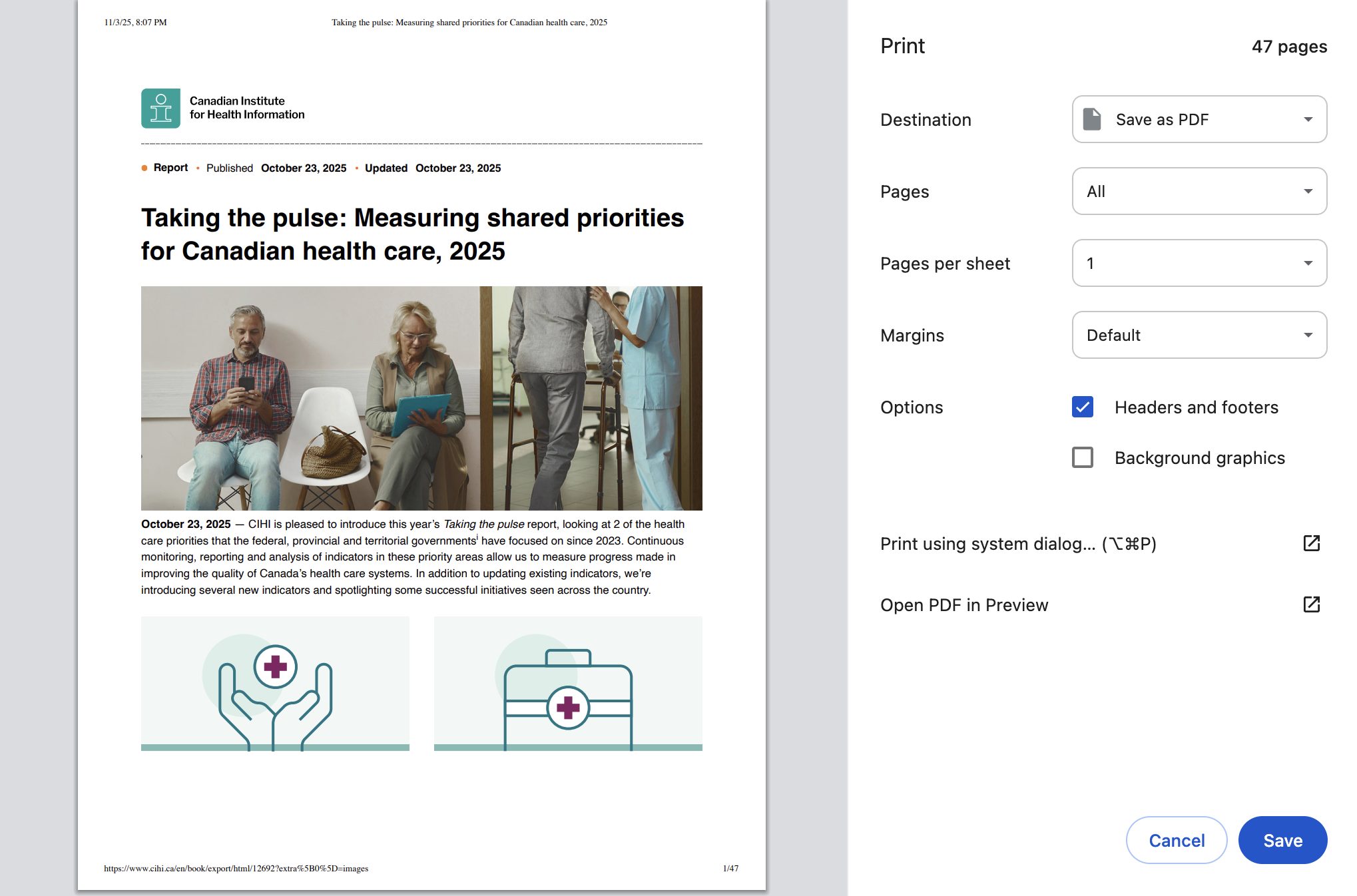
Digital Analytics showed that the already available print button was being used; however, the output of the printed pages was lacking: no CIHI branding, distorted pages, presence of unnecessary UI elements on print.
While this initially started as a focus on some pages, funding was available to tackle the whole website.

Audience

CIHI has a wide array of users that touch on data submission, data analysis, data presentation, decision making, experiencing the healthcare system or advocating for change. These are some highlighted personas:

CIHI primary personas 

Data Analyst:
Analyses data, reports on performance, provides data and analyses in response to business questions.

Advisor:
Identifies, develops proposes, and evaluates targets, priorities, policies to improve health care. Advises on Decision Making

Decision Maker:
Makes decisions to improve care and performance at their level of responsibility (e.g. provincial, regional, facility). Uses summary of data to establish strategic direction, initiatives, priorities, targets, funding and/or policies.

Researcher:
Collects and analyses data for a research project. May publish findings.
We prioritized the main visitors to reports, the most visited content category according to Digital Analytics. 

They need PDF versions for 3 main reasons: attach as appendix to their report, send as email attachment as a reference (e.g. "Here is the report I mentioned"), their own archive (e.g. "I'm unsure if this will be available in the future, I'll save a copy"). 

In some cases, they need to physically highlight documents and run in-person sessions where they share copies of the content.
Special user for Print CSS

Program Areas: 
Program Areas are subject matter experts who publish content on the website. They communicate with organizations like Canada Statistics. They have direct channels through which they receive user feedback.
Some of the Program Areas are people who have been in the organization for 16 years +, they've worked with the same users, who expect to see the same product year after year, so modernizing in such environment is challenging. We had to convince them to make a change so the quality of the PDF pages had to serve the purpose of their users (who match CIHI primary personas).

Process

1. Defining the Scope and Mitigating Risk

My initial phase focused on rigorous research to define the scope and de-risk the technical implementation before committing development resources. I synthesized findings into a comprehensive 38-page strategy document that established technical guardrails and design standards. 
Established design strategy: Best practices for PDF files and Print CSS involving technical implementation, Visual Design and UI Design standards and best practices, including some accessibility considerations.
Environmental validation: Conducted an environmental scan that confirmed the need for an in-house engineered solution due to the lack of strong industry examples.
Data-Informed Prioritization: Leveraging Digital Analytics, we confirmed the existing print button was highly used, with Reports (multi-page book modules) being the most printed content. 
Ensured Brand Fidelity: Collaborated with the Visual Design team to review existing CIHI PDF production standards (typography, copyright, etc.) to guarantee the Print CSS output met necessary organizational authority and branding requirements.
Addressed Technical Debt: Performed an audit of the current technical environment and consulted with the UX team to proactively align on strategies for tackling challenges like component inconsistencies and supporting multiple codebases (regular vs. multi-page reports).

2. Execution and Navigating Complexity

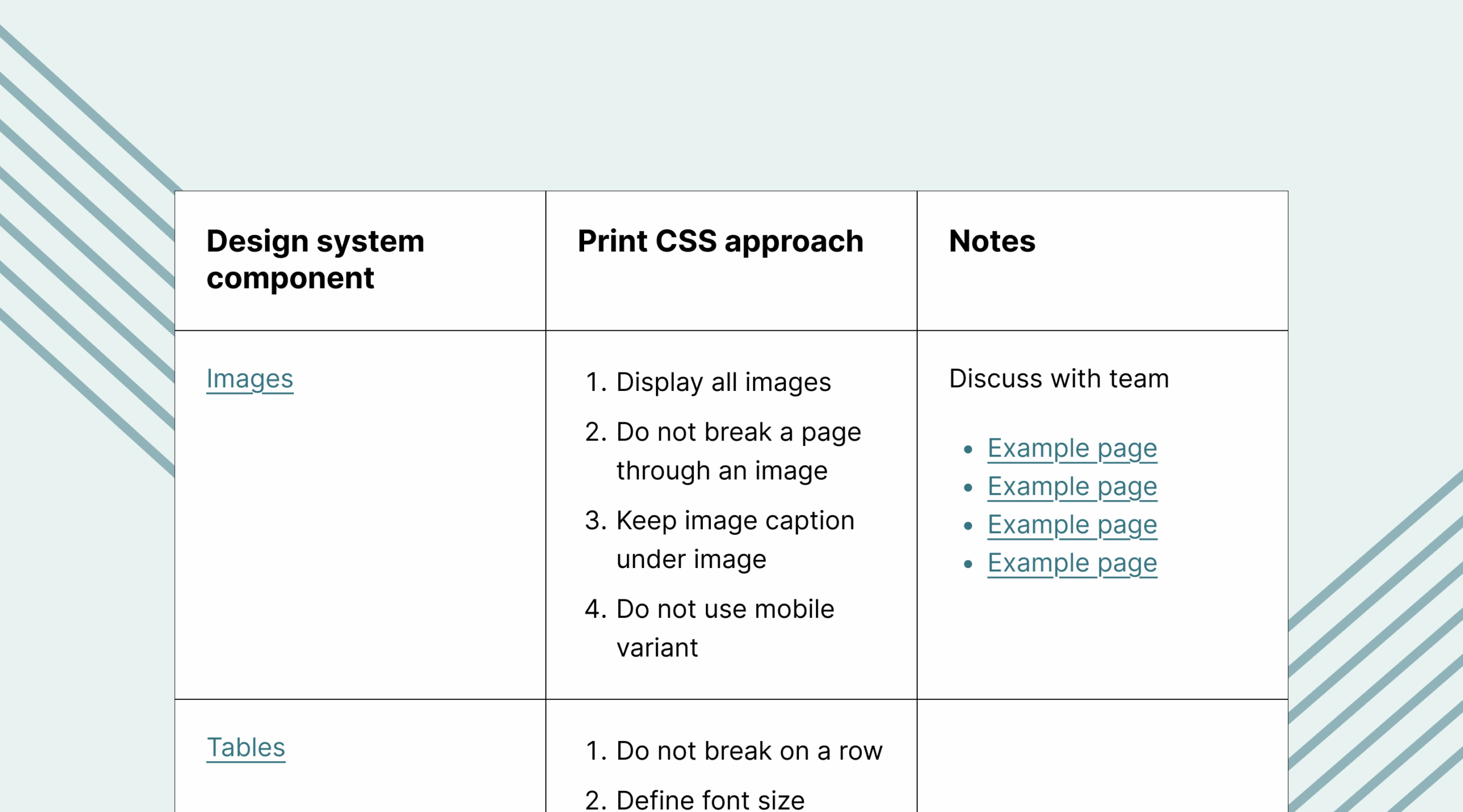
The planning phase involved a deep audit of the entire Design System. I created an exhaustive component-level inventory, translating design needs into 30+ prioritized Jira tickets with detailed specifications to guide component-specific Print CSS changes.

EXAMPLE OF THE INVENTORY TABLE

We adopted an agile approach involving incremental change and bi-weekly publications of resolved issues.

The work involved ongoing collaboration with internal and external Web Developers. I created tickets, facilitated discussions to clarify requirements, reviewed completed items, and marked them as Ready for Production.

In some cases, reviewing one ticket led to the creation of another, which was a natural part of the iterative process.
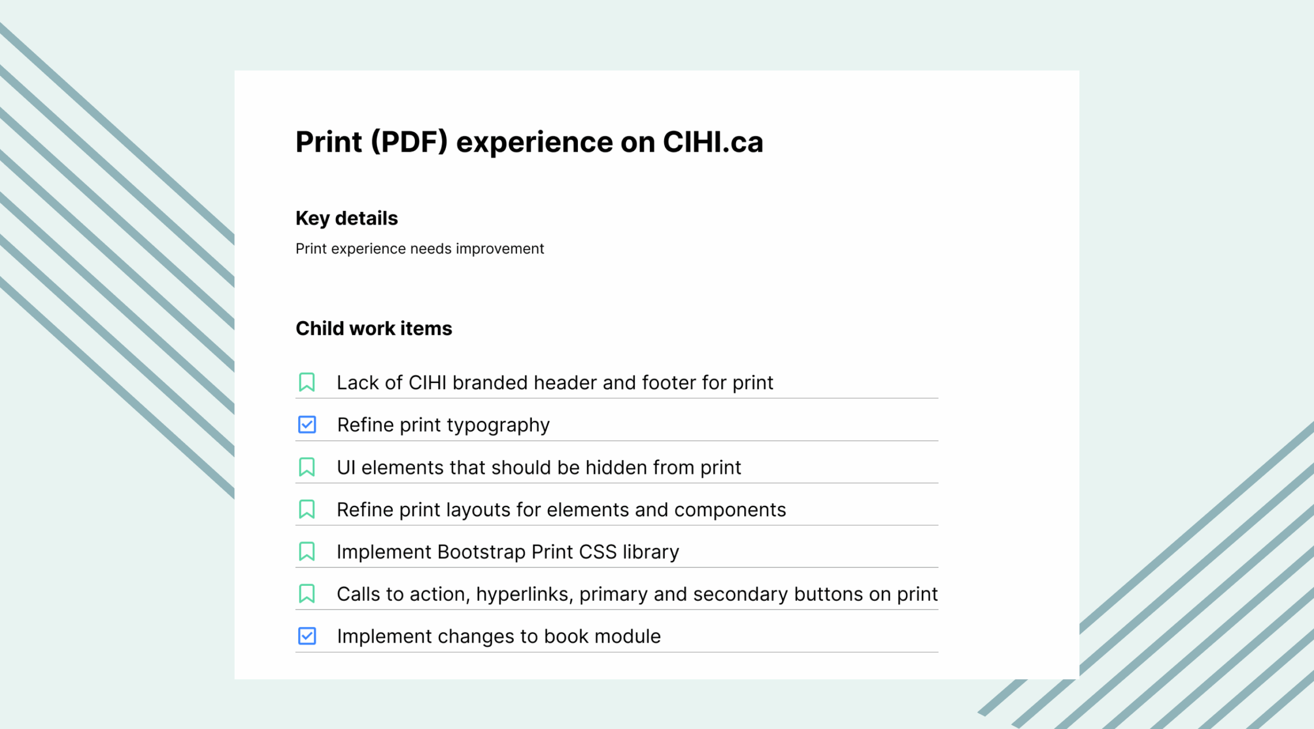
An example of some of the Jira tickets

EXAMPLE OF JIRA TICKETS

3. What Changed: Before and After

The list of items that changed is exhaustive, the examples below cover a portion of it. Scroll through the PDF below to see the before and after with selected pages in PDF format. Use the controls on the bottom to zoom in and out or view in full screen. I highly recommend that you view in full screen mode. Happy scrolling!

Challenges & Trade-Offs

Not everything was straightforward
Component Inconsistency: Applying global CSS changes was complicated by years of technical debt and inconsistent underlying code for visually similar components.
External Tool Dependency: We faced significant technical hurdles to load third-party animated data visualizations that needed to be loaded in view in order to show on the PDF version. On multi-page reports we resolved this by adding wait time so that the page can load as well as a scroll up and down the page during the wait. On the regular pages, this is still an open issue. This is the type of issue that may require guiding users by giving them instructions or the addition of loading time on regular pages to match the multi-page report. 
Dual Stylesheet Maintenance: All design changes required separate implementation across two distinct stylesheets due to the website's dual HTML designs (regular pages and multi-page reports).
Print CSS is not a solution for all scenarios: In some cases HTML is not the right format, we made a guide to help the UX team determine what the right format is during discovery. The considerations were user needs (how do they use the document), bandwidth of the content entry team, technical limitations (e.g. we can't make tables with merged cells in Drupal), lengthy content that requires frequent updates which has a faster timeline when produced as a PDF.
Technical Constraints on Design: We were unable to implement custom typography styles for print due to platform limitations, requiring us to rely on default browser settings.

Impact/Results

Through the operational work, by having the Print CSS experience, we managed to convince most of the Program Areas that required PDFs in their report publications before to move to HTML pages. The company is not tracking this but my assumption is that this is about 70% of our requests, given that the other 30% would be users that have specific needs that can only be satisfied by PDF.
Among those who adopted the HTML approach, we received only one piece of feedback, which pertained to the trade-offs made in certain data visualizations. Aside from that, there has been no feedback—an encouraging sign, as users typically reach out when they encounter challenges.

Future Considerations

Discussions in the UX team revealed that the print icon revealed that users may not always understand that printing can serve as a way to save a PDF so creating a "Download PDF" button will be useful.
Continuing the work on the improvements of printed data visualizations.
Adding a loading bar that counts down the seconds for waiting on multi-page reports rather than a spinner would help set expectations with users.
Let's make something great together!
viktorija.gjorgjievska@gmail.com
magic-wanddicelaptop-phonechart-barsarrow-right