Optimal Reading Width:
Improving Readability With a Systemic Grid Refactor

About CIHI

CIHI (Canadian Institute for Health Information) is a healthcare organization that provides comparable and actionable data and information used to accelerate improvements in health care across Canada.

Challenge

As CIHI migrated to Bootstrap 5, the technical upgrade threatened to critically degrade readability across hundreds of pages due to wider container constraints. I led a systemic refactor of our UI foundation to mitigate this risk, scaling our design system while navigating years of technical debt.

Business Goals

The primary visible business objective was to bring readability up to industry best practices and provide seamless transition to Bootstrap 5. 

Due to the scale of CIHI's website, change management played a big role in the implementation.

Role and Duration

As the UX Designer, I was the bridge between Engineering, Content Strategy, Visual Design, and Senior Management. 

I considered industry standards, technical debt, design system, responsiveness, accessibility, system adoption. 

Duration was 2 years as one of the many other projects that I was working on.

Business needs & challenge

Incorporate latest technology updates: Upgrading to latest Bootstrap was necessary to keep all systems up to date but would render the container much wider and the content less readable.
Improve readability: Publishing experts at the organization reported to our team that reading a line of text was hard. Additional updates to Bootstrap 5 would make it even harder due to an even wider container.

Audience

External primary users

Advisor:
Identifies, develops, proposes, and evaluates targets, priorities, policies to improve health care. Advises on decision making. 

Decision Maker:
Makes decisions to improve care and performance at their level of responsibility (e.g. provincial, regional, facility). 

Researcher:
Collects and analyses data for a research project. May publish findings. 

Data Analyst:
Analyses data, reports on performance, provides data and analyses in response to business questions.

Special internal users for Optimal reading width

Program Areas:
Program Areas are subject matter experts who publish content on the website and thus are the "owners" of various pages. They communicate with organizations like Canada Statistics. They have direct channels through which they receive user feedback.

Content Delivery Teams:
These are teams that enter the final content into Drupal and they are affected by global design changes. 

Strategy and approach

Rather than applying "patches" to individual pages, I approached this as a systemic refactor of our UI foundation.

The work involved research and consideration of constraints, and ongoing collaboration with internal and external Web Developers. I created tickets, facilitated discussions to clarify requirements, reviewed completed items, and marked them as Ready for Production. Whenever necessary, I communicated with other teams to align on inconsistently used components, whether that was learning the history of how they came to be or deciding on a strategy moving forward.

1. Research-based layout principles

Various sources from the industry helped determine best practices as well as defining what optimal reading width is:
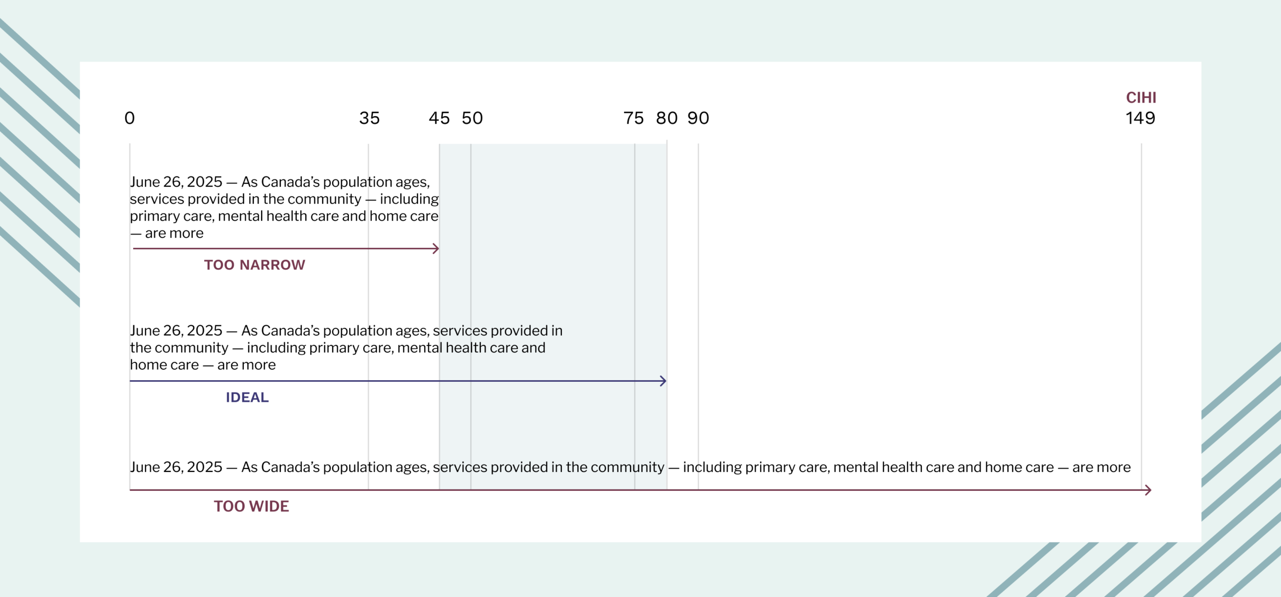
Text-Heavy Content (Target: 50–80 Characters/Line): Optimizing the layout to match natural scanning patterns. Excessively long lines break reading rhythm and reduce processing efficiency, while optimal line lengths increase reading comprehension for complex texts.
Data Applications & Dashboards (Maximized Screen Real Estate): Isolating interactive tools, tables, and dashboards from standard text constraints. Healthcare analysts require expansive horizontal space to multi-task, cross-reference data points, and interact with filters without excessive vertical scrolling.

2. Current state & constraints

RECOMMENDED CHARACTERS PER LINE VS. CIHI CHARACTERS PER LINE

Content exceeding recommended characters per line: CIHI had 149+ characters per line while the recommendation is up to 80 with some room to expand based on the nature of content.
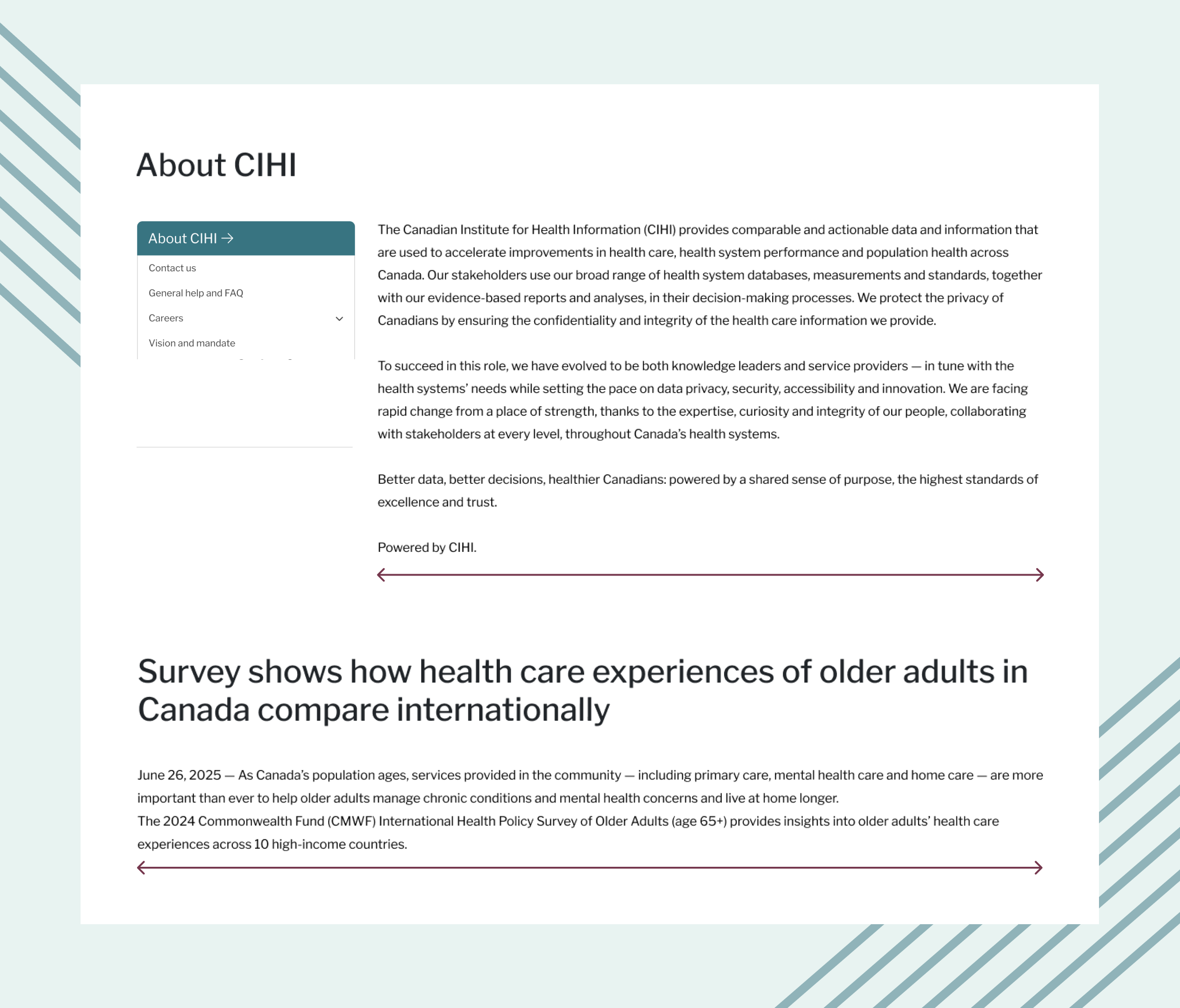
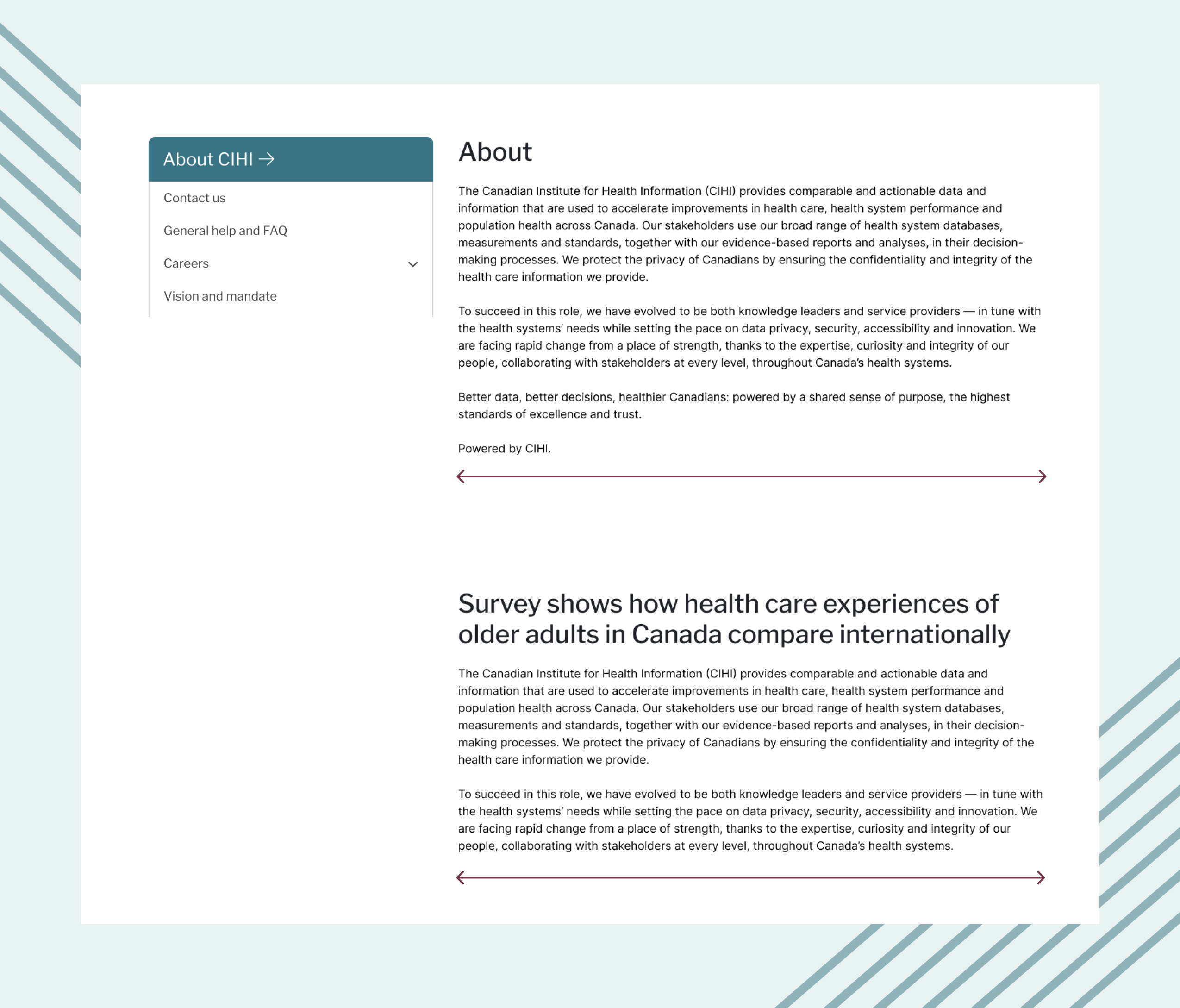
Inconsistent grid distribution amongst same content categories: Content on pages without a left navigation was wider than content on pages with a left navigation despite the same nature of text.
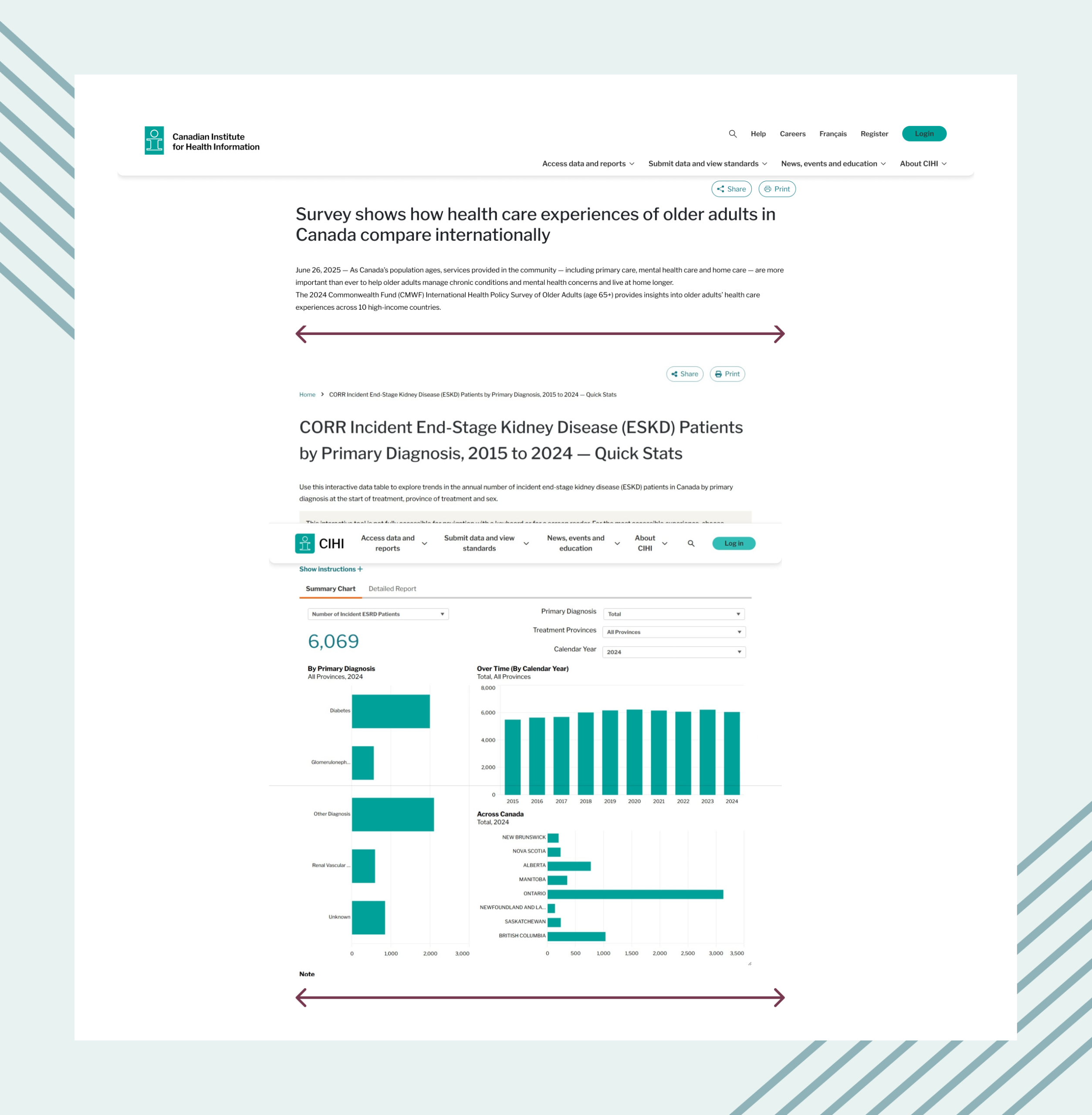
Same grid distribution amongst pages with different purpose: Content-heavy pages meant for users to read through and pages with interactive dashboards meant for users to interact with were following the same number of columns.
Inconsistent design: Years of technical dept, inconsistently built components with manual horizontal spacing made it difficult to make any changes to the gutter of the grid.
Large volume: CIHI's website has hundreds of pages separated in different content categories, testing was challenging and time-consuming. Some of the ways in which I tried to alleviate this is by requesting and inventory from the developers with all the links in an Excel document and prioritize accordingly.
Assigned widths rather than number of columns:  Some elements like banners, left navigation had assigned width in pixels rather than number of columns, making them less responsive.
Most frequent device usage:  Analytics consistently shows desktop as the primary way people access content on CIHI.ca.

3. What Changed: Before and After

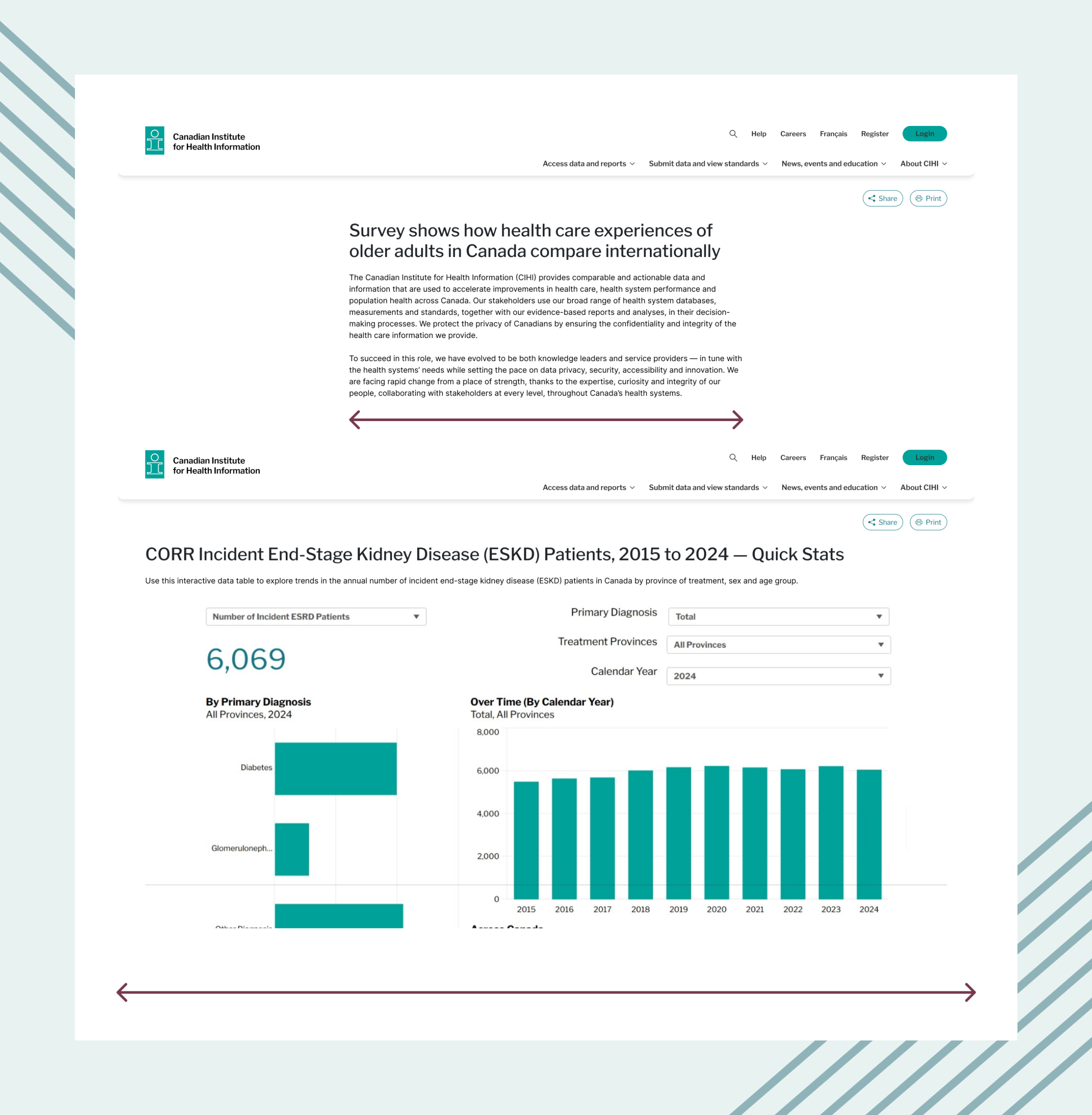
One main difference to note is that users interact differently with pages that are text heavy and applications.

Purpose: pages that allow users to read large amounts of text

before: inconsistent width for PAGES WITH THE SAME PURPOSE

Before the number of words per line was different for pages with the same purpose, reading long text.

AFTER: CONSISTENT WIDTH FOR PAGES WITH SAME PURPOSE

After the redesign, the number of words per line were consistent for pages with the same purpose and closer to the recommended optimal reading width.

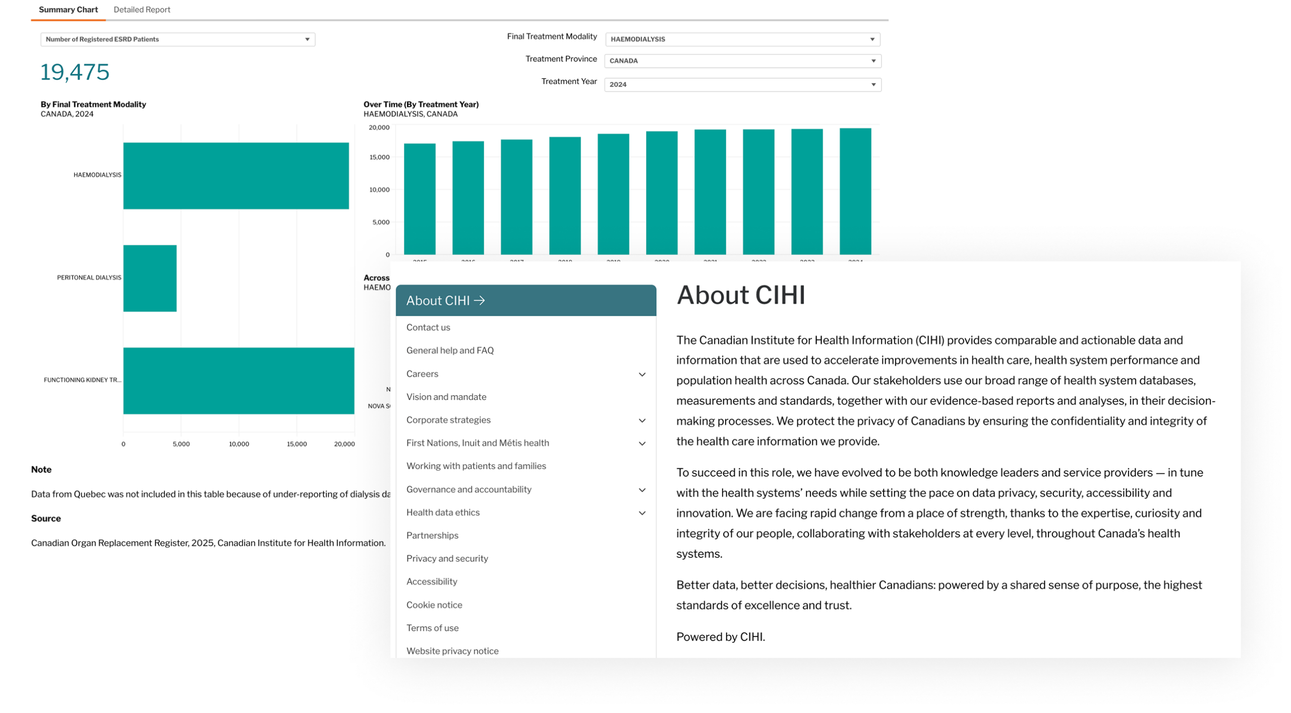
Purpose: pages that allow users to interact with applications

BEFORE: same width for text HEAVY PAGES and applications

Some of the ways users interact with applications include cross-comparison, multi-tasking, filtering, exploring multiple visuals, all of which need more physical space.

Applications at CIHI used to follow the same width as the text-heavy pages. I defined a list of content types to treat as "applications". Example: "Dashboards" and "Interactive data tools" to create a list of items that can be targeted for change.
AFTER: wider space available for applications

With the applications defined via content types, we introduced a toggle in our content entry platform Drupal called "wide screen" that would set the container to 12 columns on all breakpoints.

Other changes

Some other changes included: increasing paragraph text to 18px on the largest breakpoint to further improve readability, restructure of the top area with title, breadcrumbs, share buttons, making manually coded forms more responsive, application of the latest print stylesheet.

4. Documentation and enablement

After many iterations in a working file in Figma, I added the last iteration of the grid into our Design System, first as styles and then as a fully functioning component. I documented the usage of wide screen, as well as font size changes on XXXL breakpoint. Designers could choose the grid between different breakpoints, toggle wide screen on and off, choose a grid with and without left navigation, breadcrumbs or other page-wide components. 

5. Change management

I planned the change management and collaborated with our Team Lead and Manager for final edits on any company-wide communications.
Partnership vs. Command: Instead of pushing updates, we established weekly syncs with the Content Delivery team to resolve implementation blockers. Giving them a "seat at the table" converted skeptics into advocates.
Direct Engagement: I led a communication campaign involving targeted emails to Program Areas. I provided clear overviews, impact assessments, rationales. I also provided intranet articles to keep the wider organization informed.
Systemic Alignment: We adjusted our visual design exports to match the new grid, ensuring that all new assets produced by the design team were "born ready" for the new framework. I organized similar alignments with the Content Entry teams to align on components usage.

Chellenges

Not everything was straightforward
Component Inconsistency: Applying global CSS changes was complicated by years of technical debt and inconsistent underlying code for visually similar components. While I initially experimented to increase the gutter on the grid, ultimately I had to keep it 32px because of the manual code on a large volume of pages. 
Limited resources and large volume: Reviewing hundreds of pages each time we tested a new grid distribution amongst various content categories was quite challenging with limited resources. To mitigate this, I sourced an Excel document from the development team with an inventory of all pages on the website, which made it easier to filter and find the right pages for testing.
Resistance to change and skepticism: Incorporating a global change meant that everyone in the organization that has ever worked on a page or owns the content of a page would be impacted. The initial response to this project was followed by skepticism and resistance. To overcome that, I included the biggest skeptics in the project, and prepared a change management plan for the larger audience. From articles, to presentations, I made a full package so that everyone would be aware of the rationale behind the project and the changes they could expect before it was released.

Impact/Results

Overall positive acceptance by internal and external users.
Managing content across a legacy footprint of over 500+ pages made easy by addressing inconsistencies.
Introduction of self-serve system to save content delivery teams hours of manual layout engineering with a wide screen toggle

Future Considerations

Track engagement.
Find dynamic ways to scale font size on different breakpoints.
Continue to brainstorm how to fill out any empty space on the sides that appeared when we made the content narrower.
Continue to avoid inconsistencies.
Let's make something great together!
viktorija.gjorgjievska@gmail.com
magic-wanddicelaptop-phonechart-barsarrow-right